Jay-Z On Nets Logo Redesign
May 16, 2012 @ 9:26 AM EDT
News
[vodpod id=ExternalVideo.1018849&w=540&h=350&fv=]
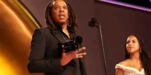
Hov kept it plain and simple—but sharp with the Brooklyn Nets logo. During his chat with MTV, the franchise’s co-owner said vintage NY subway signs were his muse.
“I wanted to make it really classic and strong; a throwback to Brooklyn and what we’re about. It’s real gritty and we’re not about flash — well, sometimes. Just the roots of Brooklyn as this very bold, strong, simple logo.
It was really a take off the old subway signs, if you look at the old subway signs they were in black and white. It was that strong, beautiful, iconic black and white. I wanted to pick something that would stand the test of time and be here forever.”


A must see website http://www.streetleaguemovement.com
fuck your website
Anyone seen this?`Here´s more on the new Nets gear:
http://parkrivals.com/brooklyn-nets-go-black-white/
[…] via @RapRadarSeen this?: #SupportSystem :: Jay-Z Stands Behind President Obama On Supporting Same-Sex Marriage […]
all that money and zero swagger.
For real I think the logo is nice as fuck
its not even that bad im interested in seeing the jerseys and arena floor now,,
I like the design that Jay & his Net co-owners have come up with, real BROOKLYN.
Somewhere the San Antonio Spurs are filing a trademark suit for the Nets jacking their whole swag. Smh.
@OMUCH
haahahahahahahaha!! Cold……